With the 2518 update, we have delivered a new dashboard as an entry page to the Integration Cockpit.
It shows the following areas:
| left | middle | right |
|---|---|---|
| KPIs (based on production interfaces) | Integration Cockpit Logo | Traffic (based on production interfaces) |
| Configurable Hyperlinks | Inventory (based on production interfaces) | |
| Landscape Check (by Integration Component) |
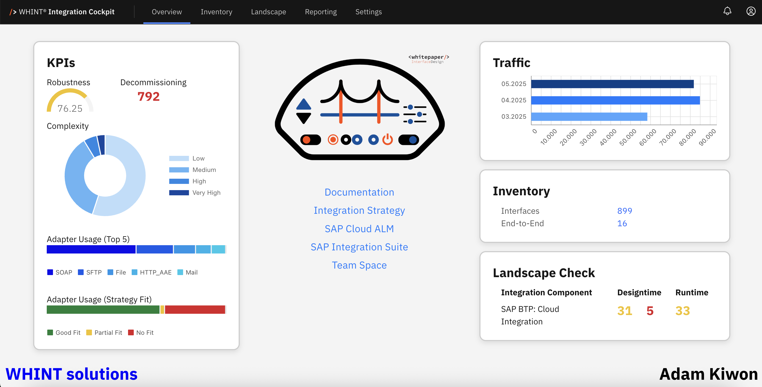
In the left column of the dashboard, the following KPIs are available:
| KPI | Description |
|---|---|
| Robustness | Shows a number as a percentage as the success rate of executed interfaces from the last 30 days in the Production environment |
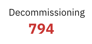
| Decommissioning | Shows a number of Interfaces w/out traffic in the last 30 days in the Production environment |
| Complexity | Shows a classification of interfaces in a donut chart from Low to Very High |
| Adapter Usage (Top 5) | Shows the mostly used Adapters within Interfaces |
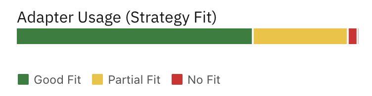
| Adapter Usage (Strategy Fit) | Shows the integration strategy fit of adapters used within Interfaces |
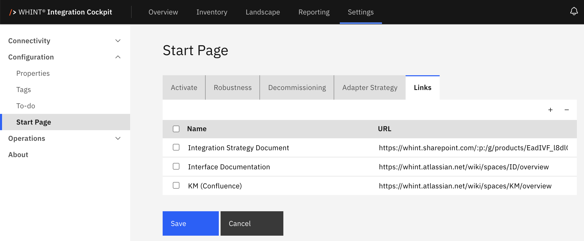
In the middle column of the dashboard, you can configure your most relevant hyperlinks, e.g. to your Integration Strategy document, your interface development governance process, your KM/Wiki or any other URL, like the most important Integration Components you need to access frequently.
In the right column, you see the following entries
| Traffic | Message Count (from Production environment) of the last 3 months (incl. current) |
| Inventory | Count of Interfaces and End-to-End Integrations (in Production environment) |
| Landscape Check | Version Comparison of integration artefacts across the landscape. > SAP Cloud Integration shows yellow (version mismatch) and red (version missing) for Designtime and yellow for Runtime (version mismatch) |
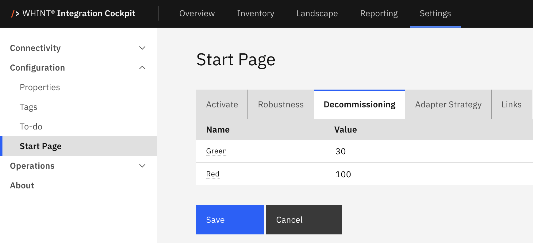
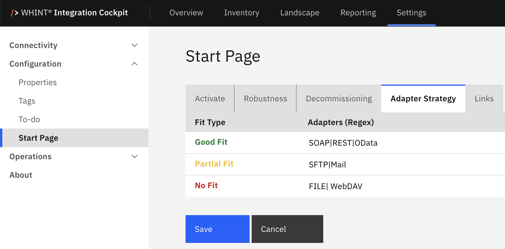
In the Settings (Configuration -> Start Page) you can configure , which content shall be displayed on the dashboard. This is a system-wide setting, and not by user (so far):
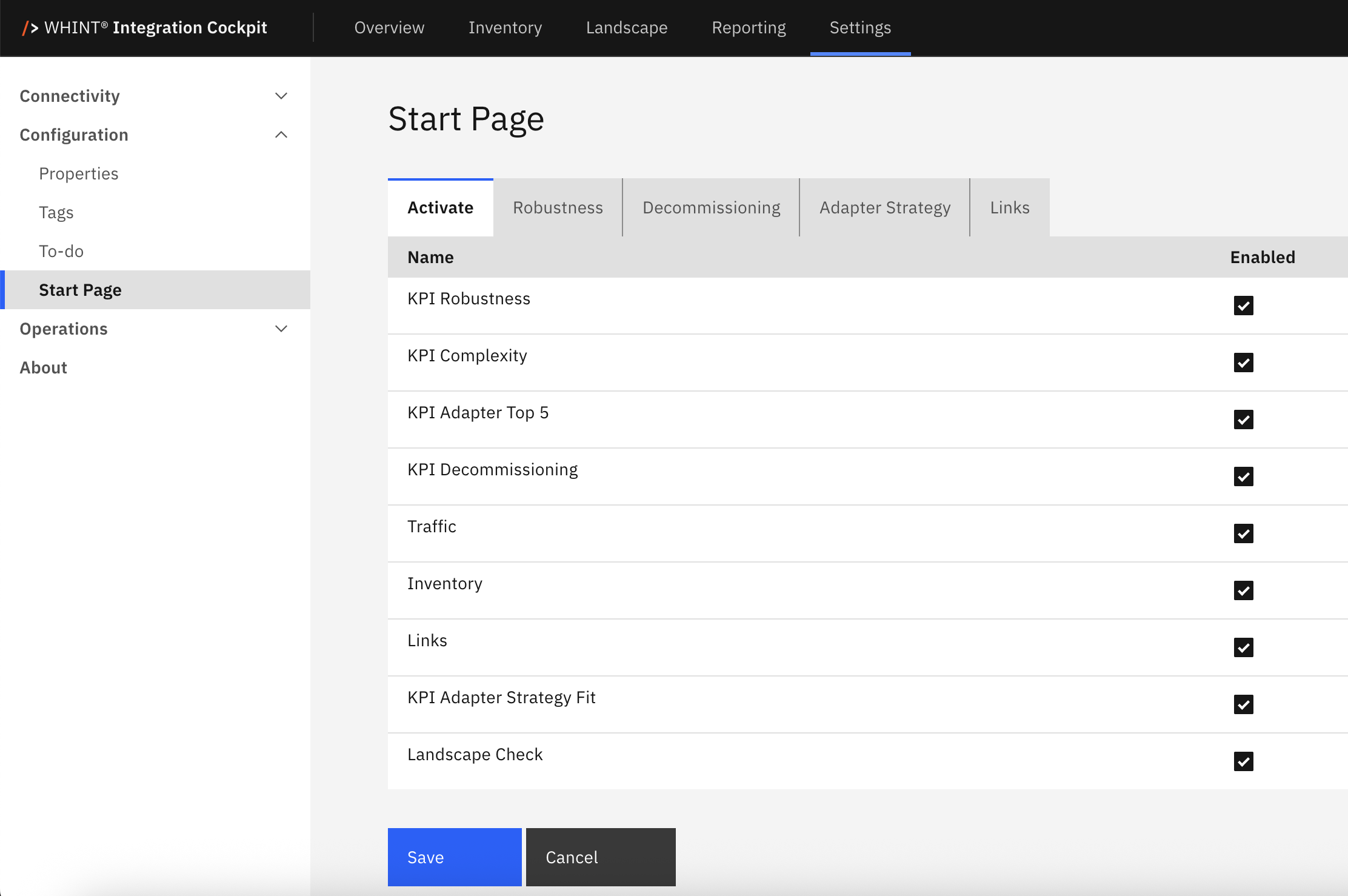
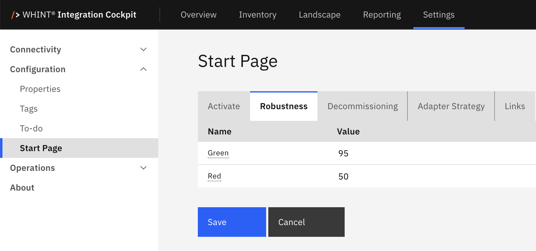
In the other Tabs of the Start Page configuration, you can configure the behavior/thresholds of configurable dashboard entries:
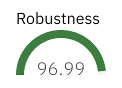
Robustness
You can define, which color the KPI shall have, e.g. green when Robustness (in Prod) is above 95, red when below 50 and yellow for any value between 50 and 95 (see configuration below):
Decommissioning
You can define, which color the KPI shall have, e.g. green when there are less than 30 interfaces w/out traffic in the last 30 days (in Prod), red when more than 100 and yellow for any value between 30 and 100 (see configuration below):
Adapter Strategy
You can define, which Adapter meets your integration strategy. You can pick from the following values:
- Good Fit (green): Adapters which are meeting the requirements well, e.g. REST, OData, AS2
- Partial Fit (yellow): Adapters which are not ideal, but can not be avoided, e.g. SFTP, Mail
- No Fit (red): Adapters which are black-listed in the integration landscape, e.g. FTP
They appear in the dashboard with the colors in the chart:
Links
You can enter a list of URLs with a text which appear as hyperlinks on the dashboard below:
Last Change: May 16, 2025
